
"It's so sad really. Its not that she's socially awkward, exactly, it like she's the opposite of awkward."
"Well, maybe she's beautiful on the inside... right?"
"No, that's not it."
Thursday, September 30, 2010
Tuesday, September 28, 2010
Op-Ed at 40
Those of you who get the Sunday New York Times probably saw the beautiful 18-page section dedicated to the 40th anniversary of the Op-Ed page. In addition to that, the NYT also produced a really touching video about the history of the page and it's illustrations. As many of you know, I used to work on the Op-Ed page as the Assistant Art Director from 2003-2005, so I have a special regard for the Op-Ed page.

To my great honor, one of my drawings was included in the video along side some of the most seminal names in the pages history. I truly have no business beside some of these folks. You can see the video here, enjoy!

To my great honor, one of my drawings was included in the video along side some of the most seminal names in the pages history. I truly have no business beside some of these folks. You can see the video here, enjoy!
Friday, September 24, 2010
Done!

I'm happy to say that my newest book is finally done. With fingers crossed. It won't be out till January of 2011, but I'd like to give you a quick preview of Nurse, Soldier, Spy: Sarah Edmonds, A Civil War Hero!

Children's books really rely on a warm and enjoyable main character, like this fellow, for example. In the case of this story, creating a look for the main character was challenging, she had to be both a girl and a boy. She had to look like a passable union soldier, but also feel a bit feminine, so the girl readers could identify with her as well. In some drawings Sarah started to look neither male nor female- just a poorly drawn figure.
 |
| My Sarah Edmonds, as Frank Thompson. |
The interior book art was finished in August, but the cover is hot off the press. As you might imagine, the cover is an essential part of branding and marketing a book. Because of the commerce part of this equation, the cover becomes the source of much hand-wringing, by artist, editor, art director and also the sales department.
I completed the first cover way back in July (below) so that it could be included in the catalog. After I finished all the final art for the interior we all decided that it needed to change. The cover was nice but it didn't feel as exciting as the story itself.

We were able to salvage the original cover, above, for the title page. Making for certainly the most elaborate title page of my book career. Once again, this is an example of a difficult change brought about by a good art director that resulted in a better final product. It is a hard thing to admit, but with good editing, most of the time your work will improve.
Here is the full wrap of the jacket, the front, back and flaps (without copy on flaps).

I've posted a few of the images from the book already, but now I'd like to give you a full sense of the books narrative by posting some of my favorite images from the story, in sequence.
 |
| My color arc cheat sheet- a thumbnail version of the entire book in order. |
 |
| Sarah wants to enlist... |
 |
| Sarah's journey from Boston as a woman to Canada as a man, and then to enlist in Michigan. |
 |
| She is rejected the first time she enlists- they think she's too young. |
 |
| Sarah desperately wants to serve in the Union Army, and will try to enlist again. |
 |
| As the war drags on, the Union starts recruiting young boys- and Sarah signs up. |
 |
| The men in her company called the dainty "Frank" by an ironic nickname, "Our Little Woman" |
 |
| She worked as a field nurse, assisting in horrific surgery. |
 |
| She also showed great heroism on the battlefield, pulling wounded soldiers to safety. |
 |
| Her bravery earned her the chance to become a spy. |
 |
| Dressed as a spy, with her skin darkened with silver nitrate powder, she crept behind enemy lines. |
 |
| In confederate territory, she meets a group of slaves working on the trench lines. |
 |
| She tries to evade capture, but is sent to work with the slaves. |
 |
| During her work, she meets other slaves who help her learn about the Confederate Army's movements. |
 |
| At night, she sneaks out to scout their cannon positions. |
 |
| The work of the slaves is difficult, she trades jobs digging for carrying water so she can get close to the commanding officers. |
 |
| She recognizes an officer who was in the Union camp, posing as another peddler, but who was actually a spy like her. |
 |
| On her way back to the Union camp, she's caught by a guard. But he only tells her to take his position for the night - he even gives her a gun. |
 |
| To get back past the front lines, she needed to say the password to the guards. |
The process of working on a long term project like this is so different than a standard editorial job. Though the bulk of the final art was done between March and August, the entire process takes about a year. So, as I send Sarah out the door, it is time to start my next book, which will be out in January 2012 titled "A Boy Called Dickens" about the childhood of Charles Dickens. Time to start practicing my top-hats and crooked chimneys.
 |
| A few shots of the cover design in progress on my drawing table... |
Thursday, September 02, 2010
John Wayne's Best Scene Ever

American Cowboy Magazine, which I confess I'd never heard of before they called, gave me a great assignment last week. They wanted a drawing of the famous "Fill Your Hands" gunfight from the John Wayne classic True Grit. As any illustrator might know, when you get the assignment that aligns with topics or content that you already LOVE, the resulting drawing is most assuredly doomed. You can't get enough distance from your obsession to evaluate it. (Like a surgeon operating on his own wife, or something.) True Grit is one of those movies that my dad taught me to love at a young age... like Raiders of the Lost Ark, Ghostbusters and The Sting.

With the bar set appropriately high- I watched the movie again. If you don't know the scene or haven't seen the film, it offers one of the immortal lines in the Western patheon. Perhaps even more memorable is the way he cocks the rifle one-handed, by spinning it around the cocking bar. Translating this into a drawing gave me an opportunity to goof around and try a few methods that might be more at home in my sketchbook. I've attached a few of the color comps and how my first sketch looked in their layout, which was also in progress. Turned out to be a fun diversion for the week. And I did the whole drawing while wearing an eyepatch.

Thursday, August 26, 2010
The Land of BCS
The college football season draws near, and this year there is some actual thought that perennial underdog Boise State just might be able to win a national title. This drawing is for the College Football Preview in Sunday's sports section of The New York Times.

Who is that in the basket? It's the TCU horned frog, another one of a sportswriter's favorite outliers with a real change of going all the way. This is one of the rare occasions when the very first sketch I did was the one I couldn't get away from. The chance to do an OZ homage was too alluring for my steel-trap brain to forget. I don't have an image of it in the page design, but I'll post it when I can.


In regards to my last mascot drawing, you can be praying that no earth-shattering college football news happens before Saturday.
Sunday, August 22, 2010

Sunday, August 15, 2010
Vacation Sketchbook
I've taken a week off from studio work and have been able to enjoy some time in my sketchbook (and I've also spoken to my family once or twice). A few selections from the week, with extended thoughts...

I spent the weekend with the Monks at Priory Abby, a nice place to get away from the world for a short time. The chapel, built by master architect Gyo Obata, was a perfect spot to spend time drawing. A woman came in while I was drawing to practice on the organ for Sunday Mass. The songs were unspeakably beautiful- notes made without effort. The residue is a confluence of a space and a time recorded on a notebook. I could have been drawing while perched on Saturn's rings, the point of view felt so fleeting and unlikely. Drawing on location is very different than just visiting a place. Even different than intentional touring, the act of drawing forces you to experience an extended slice of time in a place you normally would not. (On a similar theme but different subject, I think this also happens during prayer, when God is encountered not at a place or by an act, but only in a stretch of time.)


Part of the magic of drawing that I've long since understood but rarely heard articulated is how firmly drawing creates memories. Sure, drawing creates visual libraries of information like "How to Draw a Wood Duck." But, for me, drawing also firmly records my own presence next to the information about that wood duck.
When I draw, I remember.
See, I could draw this abby chapel again and again, perhaps with my eyes closed- because I took time to study how it worked and record it in a space that was connected to my hand. My hand was also connected to my ears, and my ears to my eyes. Drawing, I think, might be valuable to me because of these encoded time capsules. Drawing offers a way to capture the ephemeral in multiple vessels.

A drawing-in-church from today- a familiar parable I'm sure.
I have spoken to other artists about a similar drawing phenomenon, including the great Dan Zettwoch, that has to do with encoded memories in drawings. I have experienced, when looking at an old drawing I've created, a kind of narrative sensation that has to do with the audiobook I was listening to while creating the images. Each section of the drawing can carry a little parcel of the story or reveal a sensation about the narrative that comes to share part of the image's story as well. For example, the American Illustration 28 cover I worked on last year happened to collide with the first time I listened to Harry Potter and the Deathly Hallows. I can revisit particular sections of the drawing and the story comes rushing back, like a cracker-jack prize. Did that story affect the visual ideas for this cover? Not sure, but they are connected, to me, regardless.
School resumes in a few weeks- and I'll be posting my the final images from my newest book, which I just finished last week, very soon. "Nurse, Soldier, Spy: Sarah Edmonds, A Civil War Woman" comes out in January.
Speaking of the end of summer- my pool has a community reading shelf that cracks me up. A few observations:


Thursday, August 05, 2010
Oil Spill Op-Ed
Had the pleasure of being on The New York Times Op-Ed page today. A nice personal narrative about a man swimming in his Michigan lake despite a tragic oil spill, though much smaller than the one in the Gulf.
Sent two different ideas that tried to work with the page layout a bit. Loyal readers will remember that I had an oil-related Op-Ed killed a month ago, so I tried to recycle the aesthetic of those ideas.


Art Director Aviva went with A, and my first attempt used bloopy watercolor for the oil plume. It was ok, but I felt like a big black graphic shape was going to be needed to hold the page.

I tried a second time, this time using india ink and it was a big improvement. So here is the final page all together with copy and the swimmer (and buoy).

Tuesday, August 03, 2010
The ICON Wrap Up


Before we get too far away from the ICON experience, I wanted to post some images and a few links to other reviews of the events.
A really interesting and extensive wrap-up from SCAD's Atlanta Campus blog.

Thomas James at Escape from Illustration Island, has posted a bunch of great video from the event including some of the keynote session discussion.
Michael Dooley reviewed the event for PRINT Magazine and discussed the big elephant from the weekend conversation- will the necessary future of illustration be animation?

All in all it was a great conference, even though I got zero time to sit and draw during the main-stage sessions. Here is a brief summary, from British phenom Rod Hunt that features a picture of me giving my talk dressed as John Brown. I talked about the six-year journey of my book and gave some modest advice about publishing an unlikely idea... like 'being obsessed with your subject matter.'

One of the many highlights from the main-stage were the lo-fi animated art-director horror stories from Jason Holley. All of them are super funny, at least to illustrators!
The Color from jason holley on Vimeo.
I'm happy to announce that I have been elected as the next ICON President! Now it is time to start the planning for an amazing and inspiring ICON7 in 2012. Anybody have some good ideas?


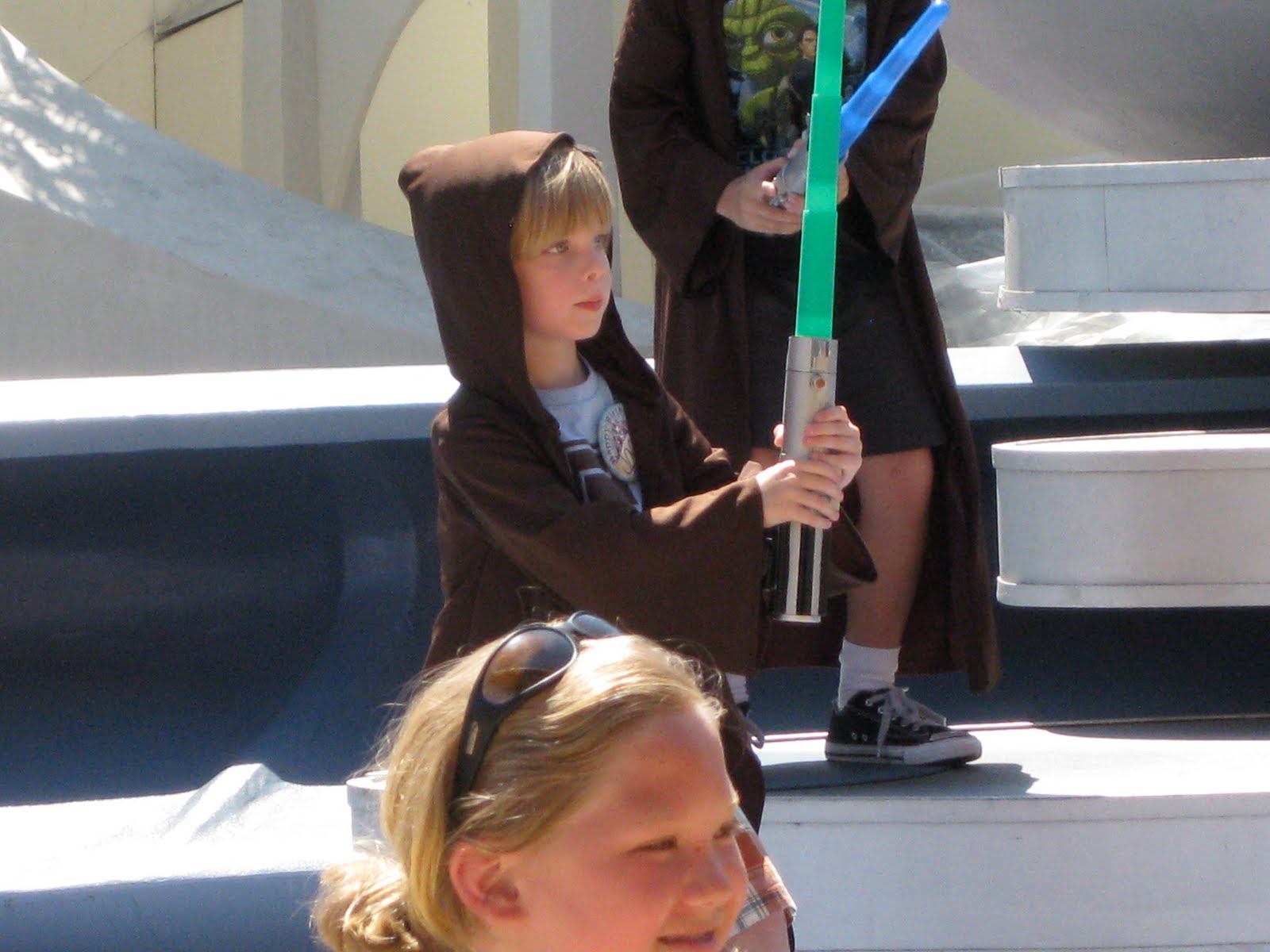
But, even though the actual conference was amazing, the highlight of the whole week was seeing my young Padawan, Jack, defeat the actual Darth Maul at the Jedi Training Academy at Disneyland on his 5th birthday! Wow!
Subscribe to:
Posts (Atom)


