

Monday, January 23, 2012

Monday, January 16, 2012

Monday, January 09, 2012
WalMart in China


The drawing runs across the fold of the opening spread, plus an additional spot on the interior of the article.
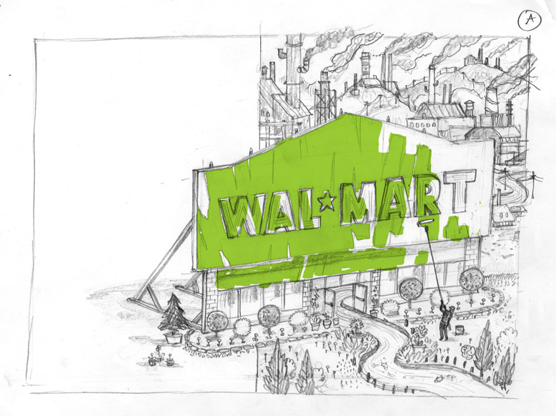

Both of my initial ideas were simliar, but portrayed slightly differently. In this case I agreed with the art directors choice for the fuller treatment, reaching across the gutter into the headline. A detail below.

Wednesday, January 04, 2012
Autopsy Lake

Perfect for a wintery January post, this cover was done for The Journal of the Norwegian Medical Association. The only prompt they gave me was to make an image about Autopsies and the secrets a body holds after death. Art Director, Emma Dalby was great- the content was so open ended and they were looking for something expressive, personal and metaphorical.


A few of you asked about my process for creating this idea... so I thought I'd put up some of my rough thumbnails, which show the visual thread of my thinking.


There are very few of these thoughts that come be useful in the final art, but they are not wasted effort. For me, ideas develop not from careful thought, but from the actual process of drawing.

Above, the drawing I sent to the art director for approval of concept.

Here, final art as it will appear on the magazine itself.

Here is a shot of the drawing on my desk, in progress... with my color comp and ice reference.

Tuesday, December 20, 2011

Monday, December 19, 2011
States of the Union

Friday, December 16, 2011
New York Times Book Review

UPDATE: here is the web link to the review.

Outside of the minor criticism about my figures, "for my taste, John Hendrix's illustrations of London succeed better than his figures" the review is very positive and features one of my images... which happens to include figures. Pretty amazing. Here is a readable image, thanks to blogger new image settings.

Tuesday, November 29, 2011
Running with Psychos

Peter Sagal, the host of NPR's quiz show, Wait, Wait, Don't Tell Me! writes a monthly column for Runner's World, and I've been asked to illustrate it this month. When Peter travels on tour with his show, he often calls local running clubs to see if he can join a morning run with some other folks... often getting rides from total strangers in the middle of the night. This of course makes him think about
being murdered by some psychopathic marathon runner...


Had an initial idea for the color that worked in theory, but not in form. Wanted to make it spooky and unify the group in blue shadowy colors... but you lose the fun of seeing all the props. In fact, some of the characters need local color (as opposed to analogous colors) to help identify who they are. So, I came up with another color idea, which worked better.


Sunday, November 27, 2011
Drawing In Church - 11/27 (with Jack)

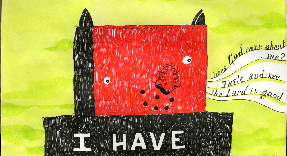
This week's church sketchbook drawing was inspired by this hairy robot that my son Jack drew the other day. So cool! His is much more interesting than mine I think.

detail of the flowers and head

Tuesday, November 22, 2011
Post-It Show 2011

Here are some of my silly Post it Notes for the Mark Todd's annual show at Giant Robot. Get'em at the opening for ten bucks each. Always wish I had time to do more each year.


Wednesday, November 16, 2011
SI 54 Award Winners
A big year for me at Society of Illustrators, I got 9 images in the show and also another piece I art directed. So thankful and humbled. The most prestigious illustration show in the world! I can only show 8 images, so I need to pull one of these, any thoughts?

All six from my Rolling Stone Trivia package, in the series category:


Three from my dickens book:


Not to mention I got a piece in as "Art Director" the amazing ICON poster!

Monday, November 07, 2011

Friday, November 04, 2011
10 Year Anniversary

Ten years ago today I turned in my first professional illustration job. I'm going to surpress my cringe reflex and post some images from that project, a interior full page for The Village Voice.
Here are a few of my thumbnails from that, and as I remember it, I think it was Minh who suggested the pirate ship idea. Note the "sails are dollarbills" stroke of genius in the bottom right.

My portfolio was a mess at the time, full of drawings and full of paintings, (I could do about ten posts on that alone) but art director Minh Uong saw something in there. He gave me a cover of the Village Voice arts guide, that ran inside the magazine. I'm grateful for him taking a chance on me, and for calling me afterwards after I gave him a sort-of-ok-not-amazing-image the first time around.

I don't want to get too wistful and self interested here, but I do want to say I'm incredibly astonished and grateful for what I've done professionally in the last ten years. In some ways, I've done more than I thought was possible in an entire career. Eager to start the next ten years of imagemaking. Thanks Minh for that first call!
Tuesday, November 01, 2011
50th Anniversary Cover Type

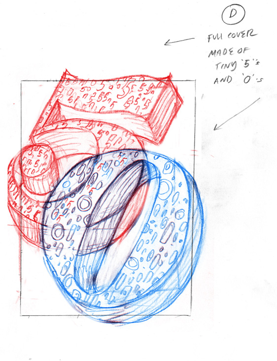
Thanks to Alissa Levin at Point Five Design, I got the chance to do this cover package for Columbia Journalism Review about the future of media and reporting. All they wanted was big beautiful type on the cover, celebrating 50 years of CJR.

I did some portraits of a few prominent figures in the conversation, as well as this funny Mad Lib homage for the opening spread.


A few of my other ideas for the cover...


Subscribe to:
Posts (Atom)


 Posts
Posts


