

Tuesday, March 27, 2012

Dangerous Waters

Got a stellar job which gave me the opportunity to draw the Titanic for the young adult novel Dangerous Waters, by Gregory Mone. (This year is the 100th anniversary of the famous disaster). Once again, my MFA seminar on disasters found me another job as I've become the first call for turning epic tragedies into slightly whimsical ruminations.


I sent these two ideas, the first using the classic image of how the Titanic went down, and tried an unusual point of view for B, from above with dramatic forced perspective.


Going from the rough sketch was going to be tricky without some great reference, so I decided to order a model kit of the Titanic. I put it together with my son on a Saturday. My wife Andrea said "How exactly does this help you make a better drawing?" I was starting to think the same thing while gluing microscopic portholes on this thing. But, handling something in physical space makes it so much easier to construct that object in 2D on paper. Drawing from life cannot be replaced by shoddy pictures from Google. Remember this students!

...my final sketch with the new reference.


A few details of the final drawing.
Wednesday, March 14, 2012
Peter Sagal's Childhood

A new drawing for Peter Sagal's upcoming column "Road Scholar" in Runner's World. Peter's touching piece is about running in the neighborhood where he grew up, and the memories he encounters on his, literal, jog down memory lane. As a kid, he imagines he never would have seen himself as a passionate athletic runner in adult life. So, I had the enjoyable pleasure of drawing a dorky kid in the 70's (see below).

A few of my other concepts before we settled on him jogging by himself and his house.


Tuesday, March 06, 2012

Thursday, February 23, 2012
The Pancake Palace

Roaring Brook Press asked me to work on the cover of a new young adult fiction book, by Nan Marino, called Hiding Out at the Pancake Palace, about a talented tween-pop-icon-in-training named Elvis Ruby, who flops on national television and escapes the spotlight by taking refuge in this rundown diner in the desolate pine-lands of New Jersey.
 |
| The full jacket, front/spine/back |

Rough thumbnails focused on giant signage dwarfing Elvis, showing him who's in charge now.
These super rough gestural drawings, are turned into tighter comps for the art director.

Some of my diner signage reference. Great fun looking for this stuff.


Sketch B was closest, but this diner was much too fancy, even as drawn, to be the actual Pancake Palace, so we moved the storefront to the back cover, and brought Elvis closer to the viewer.

We also added a "Jersey Devil" to the drawn logotype, as this is mentioned as being on the placemats at the Pancake Palace.


A few different versions of Elvis, trying to get the best pose... and a color comp. Wanted to get this acidy green color to the sky so his clothes would pop off the environment.

A few details...


I also did a small b/w drawing for the chapter opener.

Friday, February 10, 2012
Hipster Factory

A drawing for Adam Davidson's column (he's know for NPR's Planet Money show) from next week's New York Times Magazine about the growth of 'artisanal' economies. Vast amounts of research to find hipster produced products was the highlight of this assignment.

Monday, January 23, 2012

Monday, January 16, 2012

Monday, January 09, 2012
WalMart in China


The drawing runs across the fold of the opening spread, plus an additional spot on the interior of the article.
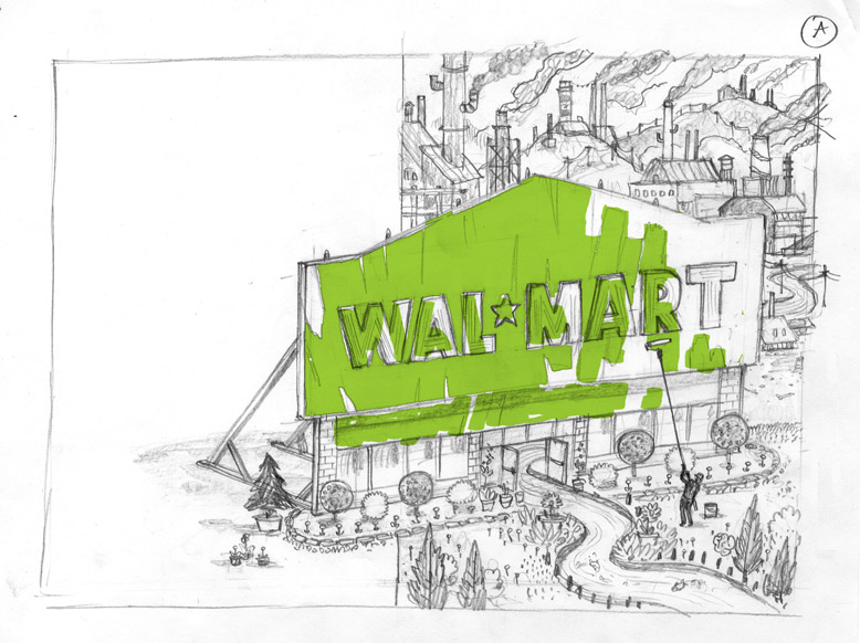

Both of my initial ideas were simliar, but portrayed slightly differently. In this case I agreed with the art directors choice for the fuller treatment, reaching across the gutter into the headline. A detail below.

Wednesday, January 04, 2012
Autopsy Lake

Perfect for a wintery January post, this cover was done for The Journal of the Norwegian Medical Association. The only prompt they gave me was to make an image about Autopsies and the secrets a body holds after death. Art Director, Emma Dalby was great- the content was so open ended and they were looking for something expressive, personal and metaphorical.


A few of you asked about my process for creating this idea... so I thought I'd put up some of my rough thumbnails, which show the visual thread of my thinking.


There are very few of these thoughts that come be useful in the final art, but they are not wasted effort. For me, ideas develop not from careful thought, but from the actual process of drawing.

Above, the drawing I sent to the art director for approval of concept.

Here, final art as it will appear on the magazine itself.

Here is a shot of the drawing on my desk, in progress... with my color comp and ice reference.

Tuesday, December 20, 2011

Monday, December 19, 2011
States of the Union

Subscribe to:
Posts (Atom)


 Posts
Posts


