Tuesday, May 31, 2011

Drawing on Beer Bottles


St. Louis, my home town, is known nationally for a few things, the Arch, good baseball, and beer. Specifically, St. Louis is the home of Anheuser-Busch, makers of Budweiser, Busch and Bud Light. This company has had a long history of working with St. Louis artists and illustrators in their campaigns- and now it is my turn in the batter's box.

A friend at Cannonball Agency called me for an unusual assignment, drawing on a Bud Light bottle. Bud Light has some new bottles out for the summer months that have a small section of the bottle where you can draw on it with a key or coin. Not only did I need to do the drawing, but they were going to film me doing it live, to demonstrate how it works.


When I first heard this idea, it seemed crazy. Based on the limitations, I really did not think I'd be able to get a good drawing out of it, but I loved the challenge. The creative directors came to my studio and we played around with the bottle and some ideas of how to draw on it. But, even if I could get a good drawing on a bottle in my studio, I'd eventually have to replicate it on set with cameras rolling! The final video is posted above, and here it is on the Bud Light facebook page. They want fans to upload images of their own drawing to the site (it is harder than it looks!)

I came up with a lot of concepts for the image, which had to focus around the idea of Bud Light, making friends and enjoying the summer.


I had a few meta 'art jokes' in there, including a reference to Magritte that would have required an expensive licensing fee (not to mention that fact that no one would get it). 


The creative directors settled on two ideas, the aliens/astronaut peace treaty and the meta-BBQ image. Once we picked these, I started practicing on actual labels on a flat surface.  The challenges were easy to identify right away. I'm creating a drawing in a space about 1" x 1.5" wide, on a rounded glass surface, using only a key or metal stylus. The one thing I didn't anticipate was how hard it was to draw on an unstable surface, especially one as small as a round bottle. 


On the actual shoot, we had an afternoon to do two drawings, and it was much harder than I expected. Not only did I have to do the drawing on a rounded glass surface with an unusual stylus, I had to do it in front of 10 people. Getting the bottle to stay in place during the shoot was tough, and not only that but it was coated with water when I was drawing- making it slip out of my hands. I didn't practice that in my studio! 


One of unexpected experiences along with this project was that I was required to get a manicure before we did the video shoot. Attention me: we are missing out on this experience. I didn't have the guts to go in alone... so Andrea went with me and had a good excuse for her own manicure. 


Here are a few details of the actual bottles with the finished drawings on them. Next time you see one of these, pull out a key and see if you can knock out a quick masterpiece.


Thursday, May 26, 2011

Boulevard of Killed Ad Campaigns


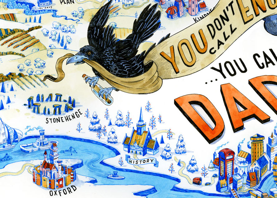
As with any field, there are often disappointments in the world of commercial illustration. Advertising projects are notorious for shifting directions and fast changes in the scope of an assignment. A perfect example is this amazing project I worked on for months- that died on the operating table. I first got the call to work on an AT&T mobile campaign back in November 2010. The art director wanted it to feel something like my sketchbook, fast, loose and whimsical.

The assignment was based on the concept that when you call another country, "You're not calling London, you're calling Dad." An interesting construction of identity and nationality, which would eventually be expanded into many different countries and personalities. (Read: $$$$$!)  This was imagined to be an OOH campaign (out-of-home) which would be in airports or bus stations.


The first round of ideas focused on whole countries, seen here with pencils and color comps. All the regions/names of the country were focused on memories of the person you were calling.


But this approach seemed too removed, so the decision was made to try it from a landscape view, where the border shape of the country was not visible. 


This was a much better solution, and the scope of the drawing seemed a better fit for the projected scale of the ads. So I did color copy with a test image before going to final art on the first drawing. 


This was approved by the client and then I made the final drawing at full scale. A few of the details below.


Alas, once we got this far, the campaign was killed, so it will never see the light of day. Hard to see a few months worth of revisions ( I didn't post even half of the sketches I did for this) go down the tubes, but you can't take it personally when it comes to advertising and live to draw another day. 


Monday, May 16, 2011

BusinessWeek Cover


Over the last year, BusinessWeek has emerged as a vanguard of cover and feature magazine design. Despite dealing with material traditionally associated with stuffiness, BusinessWeek has made a mark with forward looking graphic images.

I say that rather disingenuously, as you have guessed, because they called me last friday to do a cover image about the head of Facebook, not Mark Zuckerberg the founder, but Sheryl Sandberg, the CEO. The Art Director Richard Turley, was looking for something that had the look of my sketchbook pages, doodled and dense with zany imagery.

BusinessWeek closes on Wednesdays, and I sent a sketch in on Monday, so we had very little time for changes. The only catch was that the photo shoot was taking place Tuesday afternoon. So I had to do the drawing without any real sense of what the image was that my drawings would be accompanying. The AD sent me a rough idea of how he imagined the cover photo will be arranged, to help me get a general layout for my sketch.


I sent them the completed drawing on Tuesday afternoon without color tones once the photo came in, and it did not look as good as we expected in the smaller crop. Having her larger and intersecting the edges of the type boxes was the better solution. This would require some Photoshop surgery to get everything to fit, including the headline, which had lost it's real estate to the redesigned photo. 


Richard used these colored bars to highlight the problem areas with this new photo. I added some new drawings to clutter the empty spaces and used my digital lasso to get make the fit work just right. 


This is how the drawing looked without the photo on top of it, once the final digital edits were made.
Below are some detail images of the drawing. It was a great project, that ended with a flurry of drawing and anxiety as I once again lived up to the name of my blog. Thanks to all the great art directors and designers at Business Week!


Friday, May 13, 2011

Type Show at Gallery Nucleus


UPDATE: My original drawing sold on opening night, and a friend sent me this image which reminded him of the drawing. Amazing! I had not seen this before I did the drawing. Clearly proving that there are no new ideas out there.


I was invited to make an original drawing as a part of the Gallery Nucleus Type Show, which features a wide range of typographic designers and illustrators including Jessica Hische, Josh Cochran, Mike Perry, Darren Booth and many others. The show opens tomorrow night in Alhambra, California, just north of Los Angeles.

It was so nice to get a chance to make an image without the constraints of an art director's vision or client needs... but of course, that kind of freedom presents other challenges. My solution is kinda cheating, I created a Bodoni inspired decorative letterform that gave me enough room in the stems to create a narrative landscape. One part of making images for gallery work I had forgotten about is the amount of care you have to take with your surfaces when it will not be seen without the help of photoshop. The white areas and the colored pencil passages had to be kept very clean. The image above is how it appears in person, though much bigger.


Close followers of my blog and sketchbook may be recognize the content. The ideas for both of these images came out of the pages of my church sketchbook, one from a few weeks back about Lazarus, and this one below which I'm just posting today. If you're out in LA, hope you can make it to the show!

Thursday, April 28, 2011

New Book Reviews

I wanted to share a few good reviews of the new book, "Nurse, Soldier, Spy: The Story of Sarah Edmonds." A nice review from The New York Times "Books about Fearless Women"- it should also appear in the Sunday Book Review as well. Amazing to be included in a review next to Chris Van Allsburg.

...in the last decade especially, authors of children’s biographies have put their “Free to Be” ideals to paper, not only writing sophisticated history, but also exploring the lives of women quite different from the usual girl-crush suspects. Two new biographies, the bittersweet “Queen of the Falls,” written and illustrated by Chris Van Allsburg, and the rollicking “Nurse, Soldier, Spy,” written by Marissa Moss and illustrated by John Hendrix, are admirable and enlightening examples.

The Bulletin of the Center for Children's Books had this to say:

It’s a generally accepted fact that many women passed as men on Civil War battlefields, but the condition of secrecy, of course, rendered their stories untold. Much is known, though, about Sarah Edmonds, a young Canadian woman who enlisted in the Michigan Volunteer Infantry under the name of Frank Thompson. Serving first as a battlefield nurse, Sarah/Frank was recruited for espionage missions behind Confederate lines. Her spying days came to an end with a bout of malaria; unwilling to risk revealing her identity in a military hospital, she sought civilian medical attention instead. By the time “Sarah” had recovered, “Frank” was listed as a deserter, forcing Edmonds to retire from soldiering. Jones and Moss have sometimes conflicting, sometimes complementary takes on Edmonds’ story. Moss has her initially fleeing from an arranged marriage, and Jones from an abusive father. Moss emphasizes her nursing role and one mission as a spy; Jones discusses several of her disguises on various spy missions. Each title has a distinctive look: the jazzed-up folksiness of Hendrix’s pictures in Nurse and Oldroyd’s hazily atmospheric illustrations in Sarah. In a battle of the books, Nurse has a slight edge with snappier storytelling, a substantial historical note, remarks on the artist’s research, a glossary of Civil War terms, bibliographies, and an index, and even a pair of photographs of Edmonds and “Thompson.” There’s a pragmatic simplicity to Jones’ text, though, and she weighs in additionally with the “Thompson” photo, a brief note, and a briefer bibliography.

And a nice review from Booklist:

This lively picture book introduces Sarah Emma Edmonds, a Canadian girl who began dressing as a man at 16, later moved to Michigan to escape an arranged marriage, and joined the Union army under the name Frank Thompson. She served as a field-hospital nurse and a spy. Rather than squeezing all of Edmonds’ eventful life into a short book, Moss introduces her in a few paragraphs and spotlights particular experiences in greater detail, such as her enlistment in the army, her recruitment as a spy, and a successful mission to disguise herself as a slave and gather information behind enemy lines. Author’s and illustrator’s notes, a glossary, and source bibliographies are appended. In ink-and-wash illustrations, Hendrix, who illustrated Abe Lincoln Crosses the Creek (2008), again displays his knack for visual narrative. The aerial view of Edmonds approaching the Confederate camp is particularly effective. This large-format picture book illustrates Edmonds’ courage and determination while conveying a good deal of information in a highly readable way.

From The Sacramento Bee, a nice roundup including "Nurse, Soldier, Spy." 

Readers won't stop until the last page of Marissa Moss' exciting Civil War story about Sarah Edmonds' life as a man in the Union Army. Moss drew from Edmonds' memoir for details about her military service as a fighter, nurse and spy. Edmonds had first dressed as a man in order to escape an arranged marriage. Even though soldier Sarah, serving as Frank Thompson, could outshoot and outride many of the country boys, they called her "our little woman" because of her small stature and baby face. She laughed. She fought in several major battles, including Bull Run and Fair Oaks and then, disguised as a freed slave, spied on the rebels. Vivid illustrations by artist John Hendrix match Moss' exciting account of Sarah's life in the Army.

Friday, April 22, 2011

Drawing in Church- Holy Week Edition


My favorite Gospel story is, by far, the account of Jesus raising his friend Lazarus from the dead. It seems every year I've tried to do a sketchbook drawing on Lazarus, and never get a good page out of it. Probably because I'm pressing hard to do 'a good page' (always a doomed pronouncement.)

Part of my affection for this story is the parallel to the coming resurrection of Jesus himself, but more of it has to do Jesus's reaction to death and doubt. If I were inventing the narrative of the perfect 'God-Man' character I think he'd look more like Superman than Jesus. But, confronted with the death of a friend and the anger and disappointment of his disciples, instead of acting like a Messiah-of-Steel, we see just how human Jesus was. Even with the knowledge that he can beat death, Jesus cries. Gone, but not lost, the ending of the life of his friend overcame him. I love that he looks right in Martha's face and refused to let her spiritualize the loss. If you read the account, what he says is, essentially, "Stop thinking about Pie-In-The-Sky! Stop pretending that God is far away! ... look at me, in my face, I AM the resurrection. It is me."

This week, Christians celebrate Easter, Jesus's stunning reversal of decay and death. Lazarus is who I think about before Easter. (Though I'm guessing he didn't look exactly like the friendly mummy I've drawn when he came out. Or, maybe he did.)

Thursday, April 21, 2011

Spectrum 18 Selection


These two images were selected to appear in Spectrum 18: The Best of Contemporary Fantastic Art. I've never entered this annual before, as I've never considered my drawings to be a part of any 'fantasy art' tradition. But recently, more and more editorial illustrators have been getting work into the book- as the realm of fantasy art is defined less by unicorns and armor, and more by flights of imagination. This shift is part of a trend in our culture- the exaltation of Nerd-dom.  As a recovering/emergent nerd, I'm happy to welcome this return, and to be a part of a book celebrating Fantasy Art. One of the selected images is from my sketchbook, which is always really exciting.

Tuesday, April 19, 2011

American Illustration 30 - Selected


I was notified this week that two of my drawings were selected for American Illustration 30, a juried annual of some of the best illustration work from the last year. The images selected were from my new book, "Nurse, Soldier, Spy," which is very exciting. It is the first time any of my children's book drawings have been selected to appear in the annual. Visually speaking, these are two of my favorite images from the entire book. I'm thrilled that they will be included in this years annual. See you in November at the opening!

Tuesday, April 12, 2011

Drawing in Church 4/10


My Dicken's book is all due this week, so it is a perfect time to post some new procrastination work from my pew-side sketchbook. I've done other drawings about Psalm 29, as the metaphors are visually irresistible. The new one above is from this week, and the one below is from 2003.

Friday, April 01, 2011

Stroller Op-Ed

I've got a drawing running on the Op-Ed page in the Sunday New York Times this weekend. This image is illustrating a very funny article about strollers in NYC. Thanks to guest art director, amazing illustrator, Josh Cochran.


Thursday, March 31, 2011

Rocket Shoes


A spot for the upcoming issue of Runner's World about speed. Thanks to Marc Kauffman for the fun job. Here are a few of the ideas I sent: